Guide
How to choose a fall porch palette
The right colors make a porch look planned instead of piled. You do not need a design degree. Start with the parts of your house that will not change, then pick the palette that either matches them or gives them some contrast.
Start with what stays put
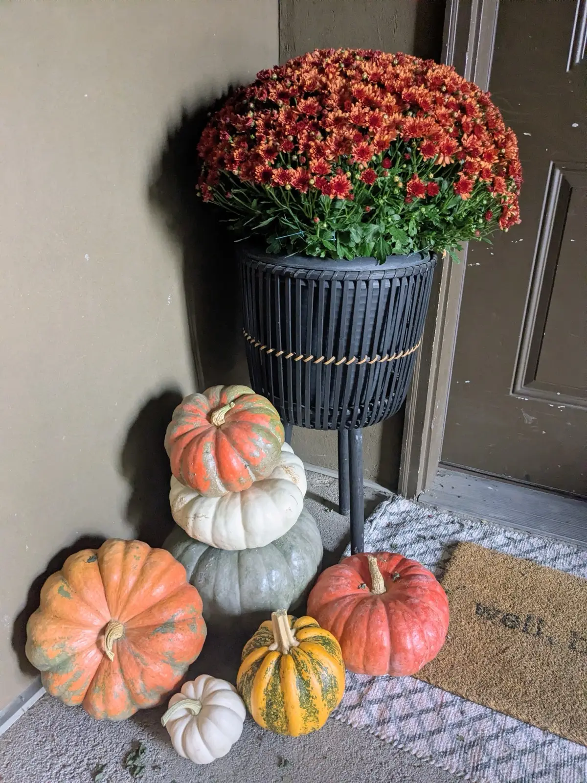
Before you think about pumpkins, look at your porch from the sidewalk. Note three things: the main color of the siding or brick, the color of the front door, and the trim. Those are the backdrop every pumpkin and mum will sit against.
Then decide whether you want the display to blend in or stand out. Blending is calm and elegant. Contrast is cheerful and easier to see from the street. Neither is wrong.
Think about how long you want it up
Bright orange is the color of Halloween. If you want one look from early October through Thanksgiving, neutral and pastel palettes age more gracefully once the jack-o'-lanterns come down. Classic and moody autumn are at their best in October.
Our four palettes
Neutral
Soft whites, tans, and beiges for a calm, natural porch.
Colors
White, Tan, Beige
Looks great with
White, black, or gray homes, modern farmhouse exteriors, and any house with a bold front door you want to show off.
With fewer colors in play, texture does the work. Ribbed, warty, and smooth pumpkins in different sizes keep a neutral porch from looking flat. It also carries straight from October into November without feeling like Halloween leftovers.
Classic
The traditional harvest mix of orange, white, yellow, and green.
Colors
Orange, White, Yellow, Green
Looks great with
Red brick, natural wood doors, tan or cream siding, and traditional homes.
Orange reads as Halloween first, so classic is the strongest choice if October is your big month. Green and white pumpkins mixed in keep it from looking like a single color pile.
Moody Autumn
Deep purples, burnt orange, red, and dark green.
Colors
Purple, Orange, Red, Dark green
Looks great with
Dark doors, charcoal or black trim, stone, deep green or navy siding, and homes with lots of warm wood.
Deep colors can disappear against a dark house at dusk. If your porch is shaded, ask for a few lighter pumpkins or add twinkle lights so the display still shows from the street.
Pastel
White, peach, pink, butter yellow, lavender, and sage.
Colors
White, Peach, Pink, Butter yellow, Lavender, Sage
Looks great with
Light siding, white or cream brick, and doors painted sage, soft blue, or blush.
Pastel looks fresh and a little unexpected, and it stays right through Thanksgiving. It works best when the house itself is light, so the soft colors are not competing with dark trim.
Quick picks by house
| If your house has | Try | Why |
|---|---|---|
| Red or orange brick | Classic or neutral | Orange echoes the brick; neutral gives it room to breathe. |
| White or light gray siding | Moody or classic | Light walls make deeper colors pop. |
| Dark siding or black trim | Neutral or pastel | Light pumpkins stand out against a dark backdrop. |
| Wood front door | Classic or moody | Warm wood pairs with burnt orange and deep red. |
| Painted sage, blue, or pink door | Pastel or neutral | Let the door be the accent color. |
A few more tips
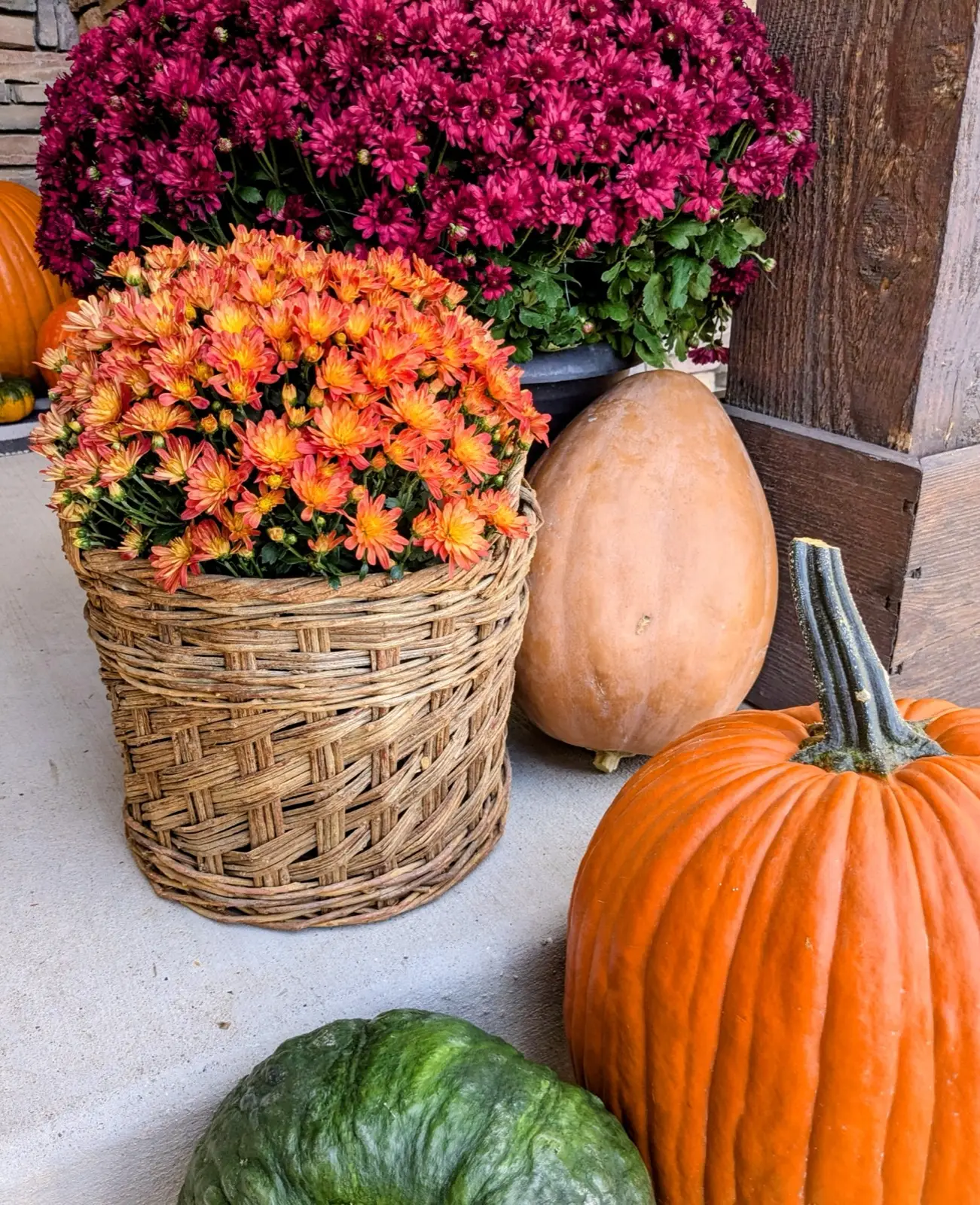
Mums count as color. A burgundy or coral mum shifts the whole porch warmer. In a neutral palette, cream or white mums keep things soft.
Repeat colors. A display looks intentional when each color shows up at least twice, for example on both sides of the steps.
Mind the shade. Covered porches and north-facing entries get less light. Lighter pumpkins and twinkle lights help a display show at dusk.
Still torn? Pick the palette you like best when you book your porch and mention your door and siding in the notes. We will design around them. You can also compare package sizes or browse packages with photos.